Join our newsletter
27 000+ people already joined


Data Apps are interactive web applications that run directly in your Keboola project. They let you visualize, explore, and interact with your data without needing external BI tools. Think of Data Apps as your custom dashboards, built exactly how you need them. Now, let's see how Kai makes building Data Apps effortless.
Consume data in your project
Turn tables and transformations into visual dashboards that anyone on your team can explore.
Share insights with colleagues
Generate a shareable link. Your team can view live data, filter results, and explore insights without accessing the Keboola project.
Gather inputs in a structured way
Build forms for budget planning, data collection, or configuration - all connected to your data pipeline.
Replace external BI tools
For many use cases, Data Apps eliminate the need for separate BI platforms. Everything stays in Keboola.
In this tutorial, we'll walk you through creating an interactive product affinity dashboard that shows which products customers buy together:

Let's get started.
I like to have clean, controlled data before jumping into visualization. So before building the dashboard, I asked Kai to create the transformation first.
I have Shopify input tables from our toy store (orders, products, customers). I asked Kai to analyze the order history and build a SQL transformation that produces a product_affinity_pairs table with four columns: product names (A and B), co-purchase count, and last purchase date.
Kai wrote the transformation, I reviewed the SQL, approved it, ran it.
Click the Kai icon in your project and describe your dashboard. Here's the prompt I used:
%20(2).png)
You can copy the prompt if you like
Create a Data App called "Buy Together Analysis" that visualizes which
products are frequently purchased together using an interactive heatmap.

Display the top 50 products (by purchase frequency) in a heatmap matrix showing co-purchase patterns

Include these interactive filters:
   - Time Period dropdown: All Time, Last 30 days, Last 3 months,
     Last 6 months, Last 12 months
   - Select Product A dropdown: Filter to show one product's affinities
   - Show Products B dropdown: Filter which products to display
   - Minimum Pairs slider: Range 1-20, default 5

Show "Data last updated: [date/time]" from the last order date

On hover: Show tooltip with "Product A + Product B: X times"

Use a color-coded heatmap:
   - White = 0 co-purchases
   - Light blue = low frequency
   - Dark blue = high frequency
   - Diagonal cells (same product) = gray
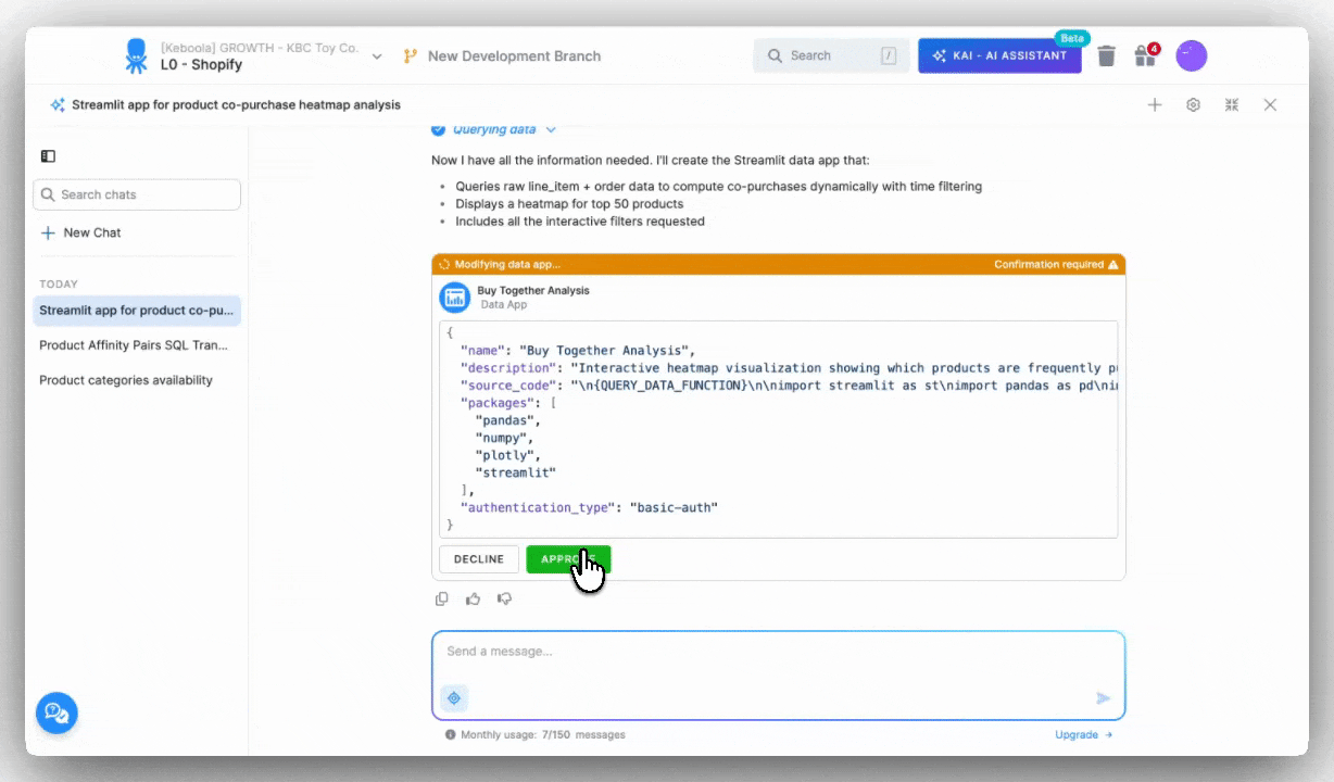
Over the next 90 seconds, Kai analyzed the table structure, wrote the Python/Streamlit code, created the Plotly heatmap, built all filter components, added a data freshness indicator, and deployed the app. All automatically deployed to Keboola's hosting infrastructure.
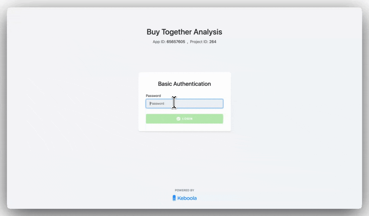
Kai provided a link to the live dashboard and a password to access it.
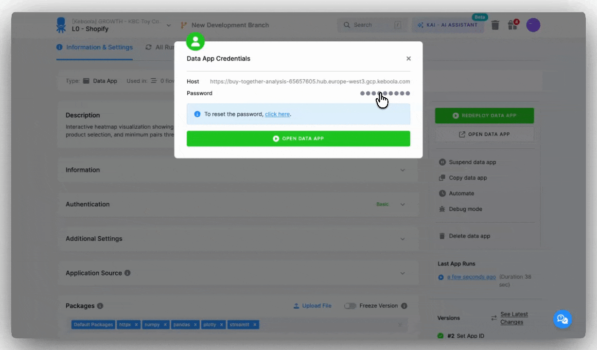
To open your newly created dashboard, click the link or press the OPEN DATA APP button on the right panel. The dashboard will load in a new window. Depending on your choice, a password might be necessary - simply copy the password and insert it to open.
Total time from opening Kai to working dashboard: around 4 minutes.
Found something to improve? Maybe it's a missing filter or a color scheme. Just ask Kai to adjust it. Don't forget to redeploy the app after any changes.

Getting the link: Click "OPEN DATA APP" on the right, it opens in a new tab. Copy the URL and share it with your team. That's it.
Password protection: By default, Data Apps use Basic authentication (password-protected). You can change this in the Authentication section:

Suspending the app: Click "Suspend data app" if you need to take it offline temporarily. The URL goes inactive, but your configuration and code stay saved. No resources consumed while suspended. To bring it back, click "REDEPLOY DATA APP."

Automatic refresh: Most dashboards don't need this, Data Apps query your tables fresh each time they're opened. But if your app needs scheduled redeployment (for example, to pick up code changes on a schedule), click "Automate" in the right-side menu and set an interval: every hour, daily, weekly - whatever fits.
When you make changes, just click "REDEPLOY DATA APP" and refresh your Data App tab to see updates.
While building you might encounter errors: connection issues, missing data, or code problems. Instead of manually debugging logs, you can use Kai to identify and fix issues.
I opened my "Buy Together Analysis" Data App and got an error instead of the dashboard. I navigated to the Terminal Logs tab in the Data App management interface and instead of interpreting them myself, I opened Kai:
My "Buy Together Analysis" Data App isn't loading. Can you check what's wrong?
Kai retrieved the logs, analyzed the error, and identified the issue (missing table). Kai found the transformation, ran it, and verified the Data App loaded correctly. Under 2 minutes from error to working dashboard.
The key here: Kai reads Terminal Logs automatically and understands context. You point it at the problem, it handles the rest.
%20(1).png)
After editing, don't forget to redeploy the app.
Enable Kai in your Keboola project (free during beta). Log in your Keboola Project and start now. Or check Kai Documentation.

Under the hood, Keboola Data Apps use Streamlit - an open-source Python framework for building data applications. It's fast to develop with, has a wide range of visualization options, and a large community behind it.
We've recently expanded Data Apps with new base images that support advanced visualizations and additional Python libraries. See the changelog for details →
The best part? You don't need to know Streamlit or Python. Kai handles the code for you.
Want to learn more about the technology?
App deployment means taking your app from code to a live, working URL that anyone can access. You don't need to worry about servers, hosting, or technical configuration, Keboola handles all of it.
During deployment:


.png)